Windows 10 is unfinished
Windows 10 came out some hours ago, and, surprise surprise, it’s unfinished! I can’t complain about the system stability (even though the Windows Reliability History tells me there have been some errors happening in the background), but the RAM usage has gone up when compared to 8.1. On a device with just 2 GB of RAM, this matters, but not nearly as much as what’s coming next…
What’s worse is really the touch experience – ruined, compared to 8.1. Imagine the touch keyboard no longer docks properly, which means 90% of the time the cursor is behind the keyboard, and I can’t see what I’m writing (I can’t believe nobody complained about this in the previews!). Then there’s the ultra-invasive privacy settings defaulting to on, which I disabled on the first run setup, but apparently, some choices were ignored – for example, I disabled error reporting, and when later I went to check, found it enabled in its highest level.
Windows 10 still suffers from many of the problems of Windows 8 in terms of UI inconsistency. The void between the “modern” UI and the classic desktop is greatly reduced, with Modern apps and Universal apps running windowed just like all other software. But things are far from perfect.
Microsoft didn’t quite manage to get rid of legacy design paradigms, and the OS still speaks at least three different design languages: if you look carefully, you’ll see elements that would fit better in Windows 7, others that are the continuation of the “modern UI” design, and things that would really fit better in XP and earlier (like the small, tabbed setting dialogs reachable from the legacy Control Panel).
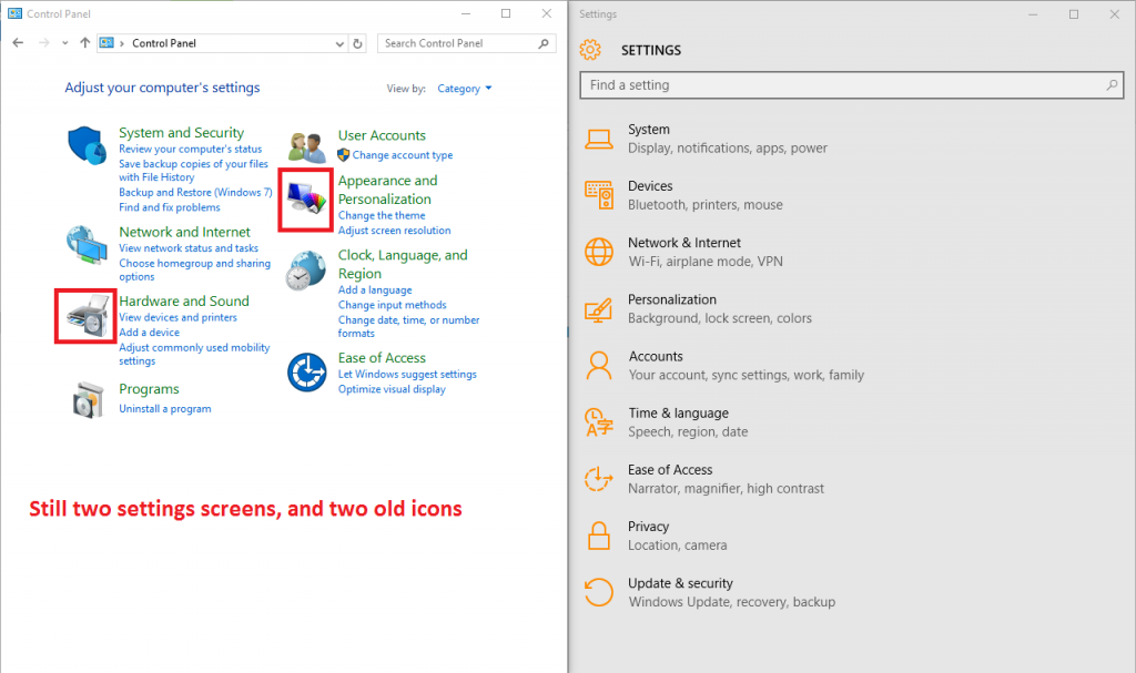
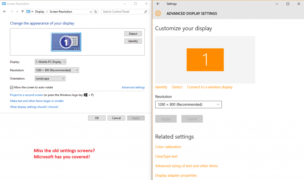
There are still two control panels, with certain things only accessible in one of them, and others available in both but with different names for the same thing (or the same thing, but negated, as is the case with screen rotation lock – in some places, “on” means “do not rotate”; in others it means “allow rotation”).
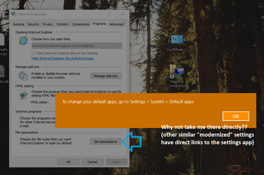
At least, there are now some more links between the two settings panels, but sometimes Windows will just tell you “This setting is now on …” without actually taking you there.
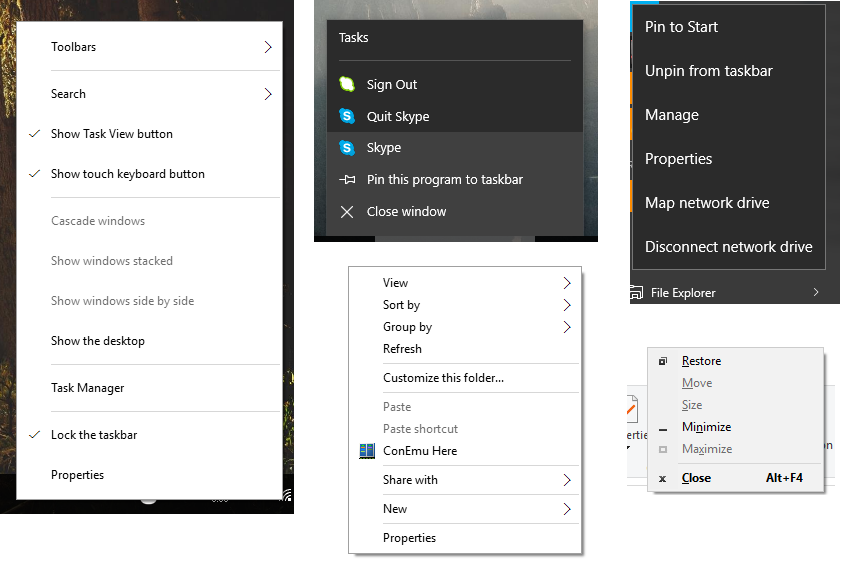
Depending on where you right-click (and, for certain things, how the planets are aligned) you can open at least four different styles of context menu.
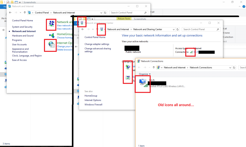
Both Windows 8 and 8.1 were, even despite their messy paradigms and inconsistent styles, more polished in terms of looks than Windows 10. Windows 10 has an incomplete icon set, with many icons yet to be updated to the new design. The fact that the icons are very different from those of 7 and 8 (the icon change from 7 to 8 was much more subtle) only makes the problem worse. You really don’t need much effort to find icons yet to be updated.
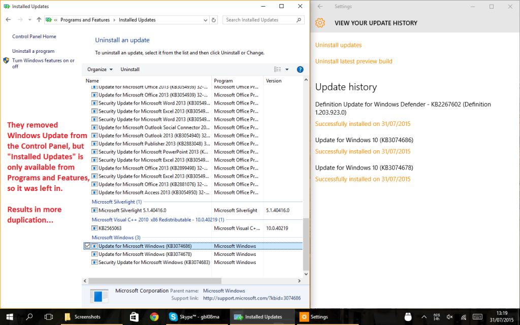
Leaving design aside, we can see that they tried to remove some functionality, like Windows Update, from the legacy Control Panel. But the migration transmits a feeling of incompleteness:
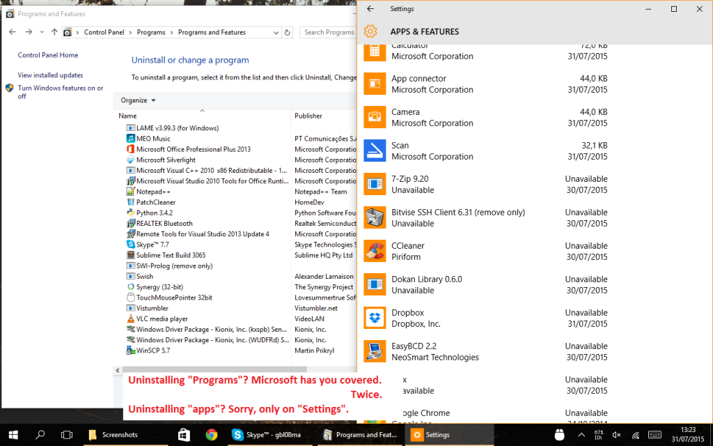
Many settings are duplicated in the Settings app and in the Control Panel. But it’s often not a 1:1 relation: to uninstall modern apps, for example, you must go through the Settings app. Going through the old Programs and Features won’t show these apps.
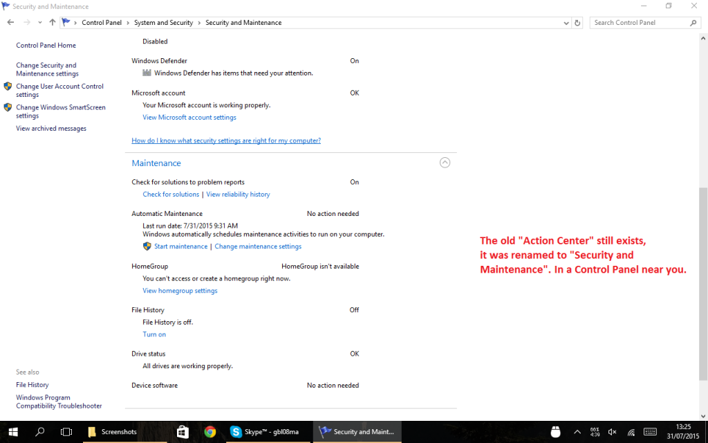
Certain things were renamed – the “Action Center” is the new notification center of Windows 10 (which is a really appropriate name, and what the Action Center should have been since the beginning). If you are looking for the old thing, it still exists:
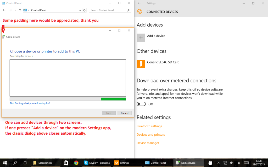
There are at least two ways to add devices, with different UI flows. Also note the lack of padding on the icon of the window to the right:
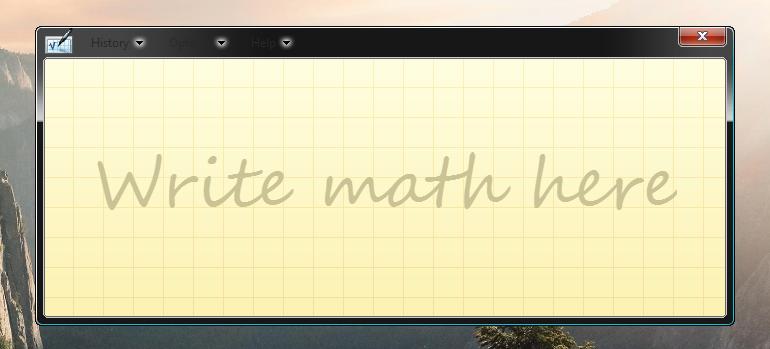
The sometimes useful Math Input Panel is still stuck in the past of Windows Vista or 7, with obvious readability problems in the menu:
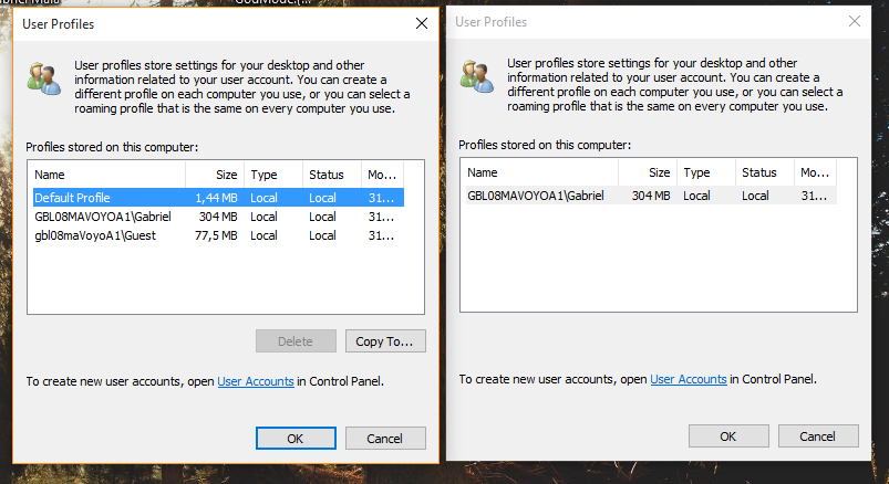
Then there are gems like this dialog, that depending on from where it is opened, shows different items (possibly not exclusive to Windows 10):
The first non-preview release of Windows 10 still contains too many rough edges and suffers from a lack of attention to detail I was only used to seeing in older Windows’ preview releases. I say “first non-preview release”, because as Microsoft is switching to a rolling release model, it no longer makes much sense to call this a “final release”.
Intentionally or not, Microsoft pushed the quality assurance process to the final user. For what is supposedly the best Windows ever made, I’m not impressed. Thank God I didn’t pay for it (even though it’s for sale, and it’s not cheap).
no
July 31, 2015 - 21:24
hey look another purposeless complaining post
gbl08ma
July 31, 2015 - 21:27
Indeed it’s complaining, I want my touch keyboard fixed ASAP so I can write about the good things in Windows 10…
John
July 31, 2015 - 21:54
If you don’t like it, don’t use it and move to another OS.
gbl08ma
July 31, 2015 - 21:59
If I didn’t like it, I wouldn’t have gone through the trouble of writalsoing so much about it and taking so many screenshots, don’t you think?
But I also think it’s unpolished, hence why I’m complaining. And yes, I have already expressed my opinion through Microsoft’s tools too.
eh
July 31, 2015 - 22:05
I read this and feel like you’re really grasping for things to rip on, although all are valid complaints.
But lets be honest, your mind was made up before you ever installed the OS. Hardly an unbiased account.
gbl08ma
July 31, 2015 - 22:33
Indeed I use Linux (and have used for years) on my main laptop, and that’s pretty telling. But I was extremely happy with the progress Microsoft had made with Windows 8 in terms of touch interaction (and my tablet is not even a Surface). I had hopes Windows 10 would not get worse in this aspect, and also fix the UI inconsistencies I pointed out. Let’s wait for the updates…
Pka
July 31, 2015 - 22:07
What kind of comments are those? Free speech jada jada. But please have at least some idea what you are talking about? Seems like you didn’t even give this read a minute… At least look at the pictures?!
Aaron
July 31, 2015 - 22:08
If this is all you could find. Damn I think they did a pretty good job.
gbl08ma
July 31, 2015 - 22:29
Indeed, in terms of stability (for example) it seems at least as good as Windows 8.1. And it seems the in-place upgrades are working well for a lot of people (myself included).
My point was only that their claims of this being the best Windows version ever are exaggerated. They broke the touch keyboard, for me that’s really bad. For others it’s not even a slight annoyance.
Robert
July 31, 2015 - 22:15
There were two settings screens for all these things in windows 8.1 also. doesn’t mean it’s unfinished, just means they left the legacy stuff in for people who like it.
gbl08ma
July 31, 2015 - 22:26
I highly doubt they left it for legacy purposes, because many things are gone from the control panel (e.g. Windows Update).
I know the duplicates existed in Windows 8, but I can tolerate problems in one version. Windows 10 would be when they would get it right (let’s wait for the updates). This really feels like a rushed release.
Jason
July 31, 2015 - 22:23
Terry Myerson said it several time, Windows 10 will never be finished, that is to answer your title. But to answer your post, it seems to me that these are a very special case issues that as you said no body complained about, so either you are super unlucky or your PC specific setup is not like any of the 5 million insiders who tested Win10 before it got released publicly.
So I suggest you save the time and post this to Microsoft Answers instead of misleading the readers with inaccurate and unique cases. We, thw bloggers have a message to deliver and this message should be accurate and clear.
gbl08ma
July 31, 2015 - 22:38
The touch keyboard issue is not, I hope, a generalized issue. Same for the RAM issue. The design problems, though, probably are present on every install. This is my personal website and this is (part of) my personal opinion, specific to my setup. I’m not stating any of this as universal truth.
Chris
July 31, 2015 - 22:27
Welcome to hacker news!
I totally agree with you. How can Microsoft make so much money without even paying attention to the image asstets in their flagship product? Inexcusable.
Jack
July 31, 2015 - 22:35
So glad I switched to Kubuntu along with friends and family. I’d never have expected, but after some very brief retraining, support time has become completely negligible. No more spyware, no more confused calls about how to perform basic office tasks.
LOL
July 31, 2015 - 22:39
Loving the folks rushing to the defense of Windows 10. Good job kids
Jptbaba
July 31, 2015 - 22:53
My thoughts.
Here’s why.
1) Cause Microsoft has forgotten the very essence of their own creation. The DESIGN OF UI. Badly hacked pieces of Metro element to form settings. Just look at the Systems settings -> About page. Yuck! Everything is just labels and hyperlinks and vertically stacked on top of each other. No concept of panels, frames, alignment. WTF and for god’s sake this shit is in public release.
2) Microsoft completely forgot power users, IT professionals. They want detail, not eye-candy. You expect turning a desktop into a phone will give you greater control over your infrastructure.
3) 2 ways or mixed ways of doing the same thing. I open settings in Metro, it opens legacy application, I click somewhere it opens Metro settings again.
4) WTF are you pushing metro down our throats? Metro is not for desktops, that’s it, Simple as that. At least don’t mix 2 together.
5) People who say windows 10 is great belong into 3 categories. => Kids, gamers (just plays games all day and thinks latest is the best), people cause they get it for free.
But power users, professionals, 3d designers (they should ditch windows and move to Mac now) and only ones who knows the art of design in software stays back with Windows 7. Wake up, Microsoft does not know everything and they are not always the best. If they gave you stuff for free, its because of their marketing tactics to make you pay later on for small things like Solitaire.
6) Devs Lazy, too lazy to write Windows code separately, so just hack them together.
And btw, redditers are full of people belonging in those categories mentioned in point 5. Any negative comment like these would get downvoted very quickly.
You may say I shouldn’t use Windows 10 then. But the thing is I have been using windows for a very long time. I want Microsoft to listen and improve instead of catering to only few people.
Boris
July 31, 2015 - 23:05
Thank you for taking time to write such an informative and productive post. Ignore the trolls 🙂
Ankit
July 31, 2015 - 23:39
I also installed window 10, oh my god it’s headache after few minute i back on my previous window 8.1
.
I face the major problem are
1> brightness function are not working,
2> i have dual graphic system both are not open.
3>kaspersky not open.
4>mouse right click on desktop gives fewer option than window 8.
.
I really feel that window 10 is uncomplete.
–
gbl08ma
August 1, 2015 - 00:13
These sound like problems really specific to your system and which you’d need to solve no matter how good or bad Windows 10 would be. Problems 1 and 2 really sound like driver problems, you should look for Windows 10-compatible drivers. If the hardware is very old there may be no drivers available, in that case I think it’s better if you stay with 7 or whatever you were running before.
Schmidty
August 1, 2015 - 01:06
Not sure how you caught all those little design issues without mentioning that the visual focus model is hopelessly vague, AND just a poor copy of a really popular Linux Mint theme, AND the custom color concept has become something of a lie. Setting the taskbar and windowbars to your color is possible but totally hideous. Color highlights in the standard gui elements (which JUST arrived last demo build) are even stuck in the default “custom” color. These are the sort of things preventing them getting round to completing the icon set.
The search performance is terrible relative to 7, both in speed and result quality. Boot has slowed down relative to the first demo build. All application performance seems to be slowing with it. Update installs get buggier and buggier. There are RAM allocation issues. On my 8GB system, I get warnings and a dramatic spurt of caching to drive when I exceed 6GB used. 64-bit minecraft set to max view distance will quickly cause a BSOD. On less strenuous days, random blasts of drive activity interrupt my music and movies.
In support of the crappy new Photos app, they’ve removed the feature in Photo and Fax viewer where it inherits the ordering of the window it opened from. Did you ever notice that? It’s absurdly handy and Photos still does it, just Photos is slow and unnecessarily animated and for some reason offers FEWER controls than the old Photo and Fax Viewer.
What I hate hate HATE is that none of this was true about the first demo build. I loved the first demo build and then had to watch them slowly ruin everything about it piece by piece. Never in my wildest dreams did I think somebody could do a worse job overseeing the progress of Windows than Balmer had but WHOOPS.
Joe
August 1, 2015 - 03:28
You should have been part of the preview seeing your knowledge in UI and criticism.
Firas
August 1, 2015 - 07:17
I agree with you! The UX team needs to double their effort. As much as I hate ugly posters, Windows 10’s interface makes me cringe a little bit. And the tablet experience is far from finished. Don’t say about being polished.
Stefan
August 1, 2015 - 12:59
Windows 10 is a complete failure to me and my corporation. I will reject it as i rejected Windows 8.x !
It is also a SPYWARE, not acceptable !
Read here: http://www.theguardian.com/technology/2015/jul/31/windows-10-microsoft-faces-criticism-over-privacy-default-settings
Dave
August 1, 2015 - 13:10
I agree with all of the critique. Think however after jumping from windows 7 to 10 I find the new part of the os excellent as far as technical progress is concerned, but trying to offer the best of both worlds out of this offering hasn’t worked. Surely Microsoft could forsee this two-tier duplication. I must say there’s a lot of updates required to get this os right!
Dr. Krabs
August 1, 2015 - 23:22
Windows 10 is a mess and I find it to be worse than Vista. That’s right.
I noticed all of these too, and I used the preview. I gave feedback for most of these kinds of lazy oversights and more, and none were addressed in the public release.
I’m also tired of people who tell me I’m the problem and they all assume I’m just trolling when I voice my hate. They tell me shit like “Oh, did you do a clean install or did you run in in a VM on a crappy old laptop??? Mine’s fine!!!!”
No, assface! Doing a clean install doesn’t fix the UI!
The only people who don’t understand what we complain about in Windows 10 are people who have no attention to detail and no taste. They deserve nothing better than Windows 10.
Gronki
August 2, 2015 - 02:02
Well, I moved to fedora Linux with gnome some time ago. Now THIS is a beautiful UI.
mustlovemonkeys
August 2, 2015 - 02:27
Just starting to read this post makes me sick. The first guy wasn’t complaining just trying to get a piece of shit that just like Windows 8 should never have been launched. Microsoft is costing all of us tons of productivity and money. Software not free. The only way to stop them is to stop buying it. I worked for them for 10 years and was loyal until Windows 8 crashed my world. Tech support more useless than anything I’ve ever seen. After months of trying to make windows 8.1 update so I had I secure computer I was finally forced to refresh which then cause me a problem with my license that new Microsoft person christx. I didn’t have that option so I had two more less learn how to program for days and weeks and months on end. Windows 10 being free just is another cluster fuck. How could they possibly released this product after what they just did to us
Debra
August 2, 2015 - 03:05
Nice all-in-one-place compilation post of the UI issues. I’ve noticed these issues too when using Win 10 through the Tech preview program. I’ve complained, but I think the development cycle was just way too short… they had too many other issues on the Fast Ring to worry with like serious crashing and UI was just kinda sploshed together last minute. My tech preview install ended up crashing and burning just as the keys were disabled, so I just flashed to Linux.
There’s not a whole lot of consistency to the entire experience of Windows 10 design-wise/UX wise. Lots of improvements, but yeah, like you mentioned, a very unfinished…
To be honest, I have more of a problem with the anti-privacy issues and other “pre-enabled” settings that got shipped with it. UI/UX design has never been Microsoft’s strong suit and I had low expectations. We’re just so used to using Windows for so long that we have been lulled into treating it as “good enough” design-wise. Their current UI seems like guess work, copying elements of Android such as notification bar (which is fine, it works), but doesn’t seem to get what great design is actually centered around… the user’s experience.
Just
August 2, 2015 - 09:30
Not to spoil all the bashing windows fun, but most if not all of these GUI issues are well known by devs, I have been an Insider since day one so to cut a long story short the most used features have been aligned to new UI guidelines. Those are the ones Microsoft is aware are the more used by general users, some other things a bit more buried in the OS will be progressively updated.
I mean as you stated at the very beginning of the post “you can’t believe insiders didn’t noticed”.
That is right…I mean are you really that naive to think that such inconsistencies were missed by over one million of people? I guess no. Does this make Windows 10 an unfinished product? uhm, no. Hence we get back to how I began this message about spoiling the bashing windows fun.
Ruben
August 2, 2015 - 14:17
I completely agree with this article. Windows 10 is half baked. But this goes not only to the UI/UX but to more impotant issues. After all some of these issues existed in Windows 8 and somehow you can get used to them and find your way around.
I am talking ahout performance ans estability. My computer has a Core i7 with 8gb ram and 7.2krpm disk. In Windows 8 the log in screen showed up in 30 seconds and i could start working in about 3 minutes. Now in Windows 10 it taks almost 2 minutes for the login screen to appear, and moran than 10 minutes to be able to start working.
The computer is now always choking. Any simple right click or command makes programs “Not Responding”
It is a piece of crap. Don’t upgrade.
KJ
August 2, 2015 - 15:12
In spite of your criticism filled post, you sound like someone who cares for Microsoft and Windows!
Loved your post! Points out about pitfalls of half baked feature release!
nmharleyrider
August 2, 2015 - 18:12
I really like windows10. Considering the tons of code that has been changed it’s an amazing release so why bitch about the little things which will be fixed. What I really liked was the ease of installation and the fact that I did not have to re-install a single piece of software unlike previous major releases where you had to install every piece of software. This in itself I found amazing and a godsend. It will take me weeks to discover all the new things in this release and I am not going to sit here and complain about what I find. I will report it so Microsoft will know the issue exists and can add it to their fix list. If you do not like Windows10 use another OS.
gbl08ma
August 3, 2015 - 12:43
In previous releases you didn’t have to reinstall software either, only maybe some drivers (same as with Windows 10). You could always do a in-place upgrade which kept all your files, settings and programs (but took longer to install as a result). Perhaps the news with Windows 10 is that it allows upgrading from two versions behind (Windows 7) when before it only supported upgrading from the previous version (if I remember correctly).
All important problems such as the touch keyboard regression have been reported to Microsoft by me and many other people, even during the Technical Previews. It’s still not fixed.
dan perlman
August 2, 2015 - 18:15
Wow, as a Mac user and sometimes Windows, this seems like the best release to come out of Microsoft for a long time. What a bunch of whining. Best advice, don’t upgrade.
marone
August 2, 2015 - 18:25
Great article!
I’ve been using the tech preview for quite a while now (since November and still to this day) and it’s true, It’s still unfinished. Many UI misfits are still here but the main problems were resolved. Stability was greatly improved but I’m really still not pleased with the control panel. Frankly it’s a mess and the best way navigating through it is by using search. Search in start menu is improved but still posing some quirks.
I guess that Windows 10 2016 edition will be the next “finished” one.
gbl08ma
August 3, 2015 - 12:40
The problem is that I’m finding out “search” is actually much worse at finding settings than it was in 8.1…
Pavel
August 2, 2015 - 20:40
Hey, nice sum-up of the annoyances and overlooked details! Luckily, nothing of this is way too serious. But the context menus, hell, they are different inside one window, or you can even meet *three* different styles on a taskbar! And not just taskbar, but the shiny new Microsoft Edge! Textbox: old Windows 8 Metro style. Page and tabs: new Windows 10 style. Title bar: old Windows 7 style. Marvelous.
Hoping they address at least some of these in the future.
Raven
August 3, 2015 - 00:44
Microsoft has never had a good, or consistent UI. And I’ve used every version since 3.1. It always takes some digging around to find things, and a lot of the UI makes no sense. It’s just as if they thought it looked “cool.”
On the other hand my main OS is OS X, which while not as consistent as OS 8, is much more polished than any version of Windows.
It’s funny reading the zealots defending crappy design!
JC
August 3, 2015 - 01:01
Some other features cannot be accessed through control panel. like Slideshow Wallpaper.
You must access to the CMD console and then type
control /name Microsoft.Personalization /page pageWallpaper
The options shown here are not available in other place.
Same for Windows defender, must be disabled through the RegEdit.
gbl08ma
August 3, 2015 - 12:38
Actually you can set a slideshow as wallpaper by going into Settings (modern settings) -> Personalization, then setting the “Background” drop-down as “Slideshow”.
See, Microsoft? This is the kind of confusion that arises from having two incomplete control panels. If you want to keep the older one while the new one is not finished (even for compatibility reasons), then you shouldn’t be stripping features away from the older one (while still leaving some duplicates in there, no less!) before the new one has everything ready.
Cam
August 3, 2015 - 02:09
I had to post a comment to say: everyone having a go at you for writing this is being ridiculous. I didn’t know the Microsoft fanboi element were so overzealous. You’ve done a great job of pointing out some serious issues with the interface design, that should have been addressed before release.
Ignore the fools. You have done really well.
John Emery of PRESTON STUDIOS
August 3, 2015 - 02:42
I too tried 10…took my machine yesterday over to the Geek Squad and had them restore it back to 7. But as an artist my issue was two-fold – aesthetics and ease of use:
– I like the aero glass look because I work with glass professionally. It is essential to what I see
– I do not log onto my refrigerator, my phone, my toaster, my washing machine, my dryer, or
any other appliance in my house. I am NOT going to log into my own computer in my own house
and did not know what to do when I rebooted and it demanded that I log in. Hello this should not
be shipped out preset like that for dumb-asses like me.
Simply put – if its not fun to work with folks it ain’t gonna happen….
Richard
August 3, 2015 - 04:50
Quite agree.
If you are a multi billion dollar company that really wants to stay that way, you do things properly.
It amazes me that after any number of iterations, they still have the carry over of old icon styles (not that there is anything inherently wrong with them) This just indicates casual laziness and contempt for the user and surely can’t be about the money? Can it?
After writing the manual on UI design, how can they keep getting it so wrong? A first year computing student would be failed for some of the stuff they ship…
Word is another piece of crap. The table formatting, among many ‘features’ is egregiously still primitive and very very exasperating.
After all this time, WTF is that no fixed?
Despite these problems, we still use the damn things. What penetration, eh?
René
August 3, 2015 - 09:29
I agree in terms of UX and consistency. It’s a long way making such a feature packed OS. It’s seems difficult to change it all way down to the roots If you don’t want to program it from scratch. There are big parts of the OS which are still like they were in Windows 7 and they still work, even they look outdated.
I couldn’t take the post serious after reading you’re complaining about old icons. Those old icons don’t make the OS less usable. They are still there and may look like vintage, but I guess average user will not care or even take notice. So not a reason to handle this first priority for a first release because making new icons takes a lot of time.
Also I see a lot of people complaining about different things like performance. They mostly forget, there is a lot more than the OS. Hardware drivers, old software… For me, my computer works better than with Windows 8. The air condition seems to work better, the fans do not make noise just because I watch a video on YouTube. Overall on my device I’ve got better performance with the update to Windows 10. So I cannot prove the point it got worse with the update.
And did you know, you can uninstall modern apps directly from task bar or start screen using right click / long press > More Options > Uninstall? Like you could before in Windows 8.1.
The thing with the touch keyboard? That’s crap, but I remember those situations from Windows 8.1. Still annoying, but this isn’t something new.
gbl08ma
August 3, 2015 - 12:33
About the icons “complaint”, it seems that people, sadly, haven’t yet understood that I only mentioned the icons as proof that the OS release was rushed, and that it is unpolished. Yes, it does not decrease the usability of the OS (even though consistency of the icons, not their beauty, are what makes them useful for quickly recognizing stuff), but it is something I don’t think I had seen before in a fresh release (not even Vista, which required quite a big redesign and rethinking of all icons). Same with the many different styles of context menu: it’s pretty good proof they didn’t have time (or perhaps not enough people) to get the user experience as they’d like to (even if in terms of stability, compatibility, etc. everything is OK).
The true complaint here is about the things that actually hinder usability, like the touch keyboard. And yes, there were similar situations in Windows 8, that were mostly fixed in 8.1. But given that they got the touch keyboard right in 8.1, and its style wasn’t even that incompatible with that of Windows 10, I don’t understand why they had to mess with it and actually make it worse, then not fixing it before the grand release. Only reason I can think of, is that with all the (somewhat unfinished) UI changes, someone messed the desktop resizing somewhere and the keyboard would no longer be able to resize the desktop when docked…
Jorge
August 3, 2015 - 12:05
100% agree. I couldn’t wait to get w10 on my computer. Reading all about it, got ISO image as soon as it was released.. However, after 2 hours of testing I rolled back to w8.1! Yes 8.1 indeed. W10 is a mess at this stage.
Grant
August 3, 2015 - 13:38
I agree, it is a mish-mash of the last few iterations of Windows. This doesn’t make it a bad OS but just complicates ease of use.
For the idiots who say “just change to another OS” there is often no choice as people run some software apps that will only run on Windows.
Bret
August 3, 2015 - 15:27
The reason that the final polish on thing like the icons and padding is important to me is because that is the easy stuff. Microsoft has 117,000 employees, and if they can’t get someone to solve easy questions like ‘make sure all 10 icons on this page have been updated’, then I have to ask myself if someone has answered a tougher question like ‘make sure every single user file is included in the backup set’.
Igor
August 3, 2015 - 17:05
As a Windows 8.1 Pro user I was eager, against the common sense and mine, to upgrade to Win 10 at that early stage, got tired of that tiled design and need to switch back and forth between tiles and desktop. First I’ve upgraded my work laptop (the one I was going to reimage anyway). This one didn’t get Windows 10 upgrade notification so I’ve downloaded Windows 10 from msdn using my subscription. It went well except that I couldn’t activate it with the license key I got from msdn (didn’t have time to deal with it yet so haven’t figured out what exactly a problem is, seems that this is because Win 8.1 and Win 10 are both Enterprise editions). I only had options to save my personal files or clean install Then I’ve upgraded my Win 8.1 Pro at home on Dell Inspiron all-in-one PC. It has I7 processor, 8gb or RAM, etc – relatively modern machine. I got upgrade notification for this one and went to install it when it was pushed to my PC. All my apps and files were preserved during the upgrade. So far so good. Then I’ve started to get internal power failure shutdowns. Here goes AMD video card drivers update. Work for a few hours, then started to do it again. Disabled AMD card for now to use just intel built in. Then I got internal kernel error and shut down again.
So these problems, along with very slow wake up times (from 30 secs in 8.1 to 5-10 min in Win10) forced me to go back to Win 8. Luckily we have that option from recovery settings during the first month. Now I’m back to Win 8, no shutdowns, quick wake up time. Staying put at least until Windows Service pack is coming out …
CJ
August 3, 2015 - 18:57
I am trying to follow your comments but when do you see the keyboard issue? Are you in there tablet mode or desktop mode. I see the difference in behavior between the two but you have alluded to a keyboard having issues docking or not docking. I have been using the keyboard in Tablet mode where it is docked.
Are you doing something different?
gbl08ma
August 3, 2015 - 22:00
I see the issue both in tablet mode and in desktop mode. If you used the touch keyboard in Windows 8.1, you probably noticed that when docked, the keyboard would resize the desktop to be only on the upper half of the screen (i.e. the part the keyboard isn’t using), more or less as if the screen resolution had changed. The only thing that would not be resized, was the taskbar (in case it was in the bottom, as per the default). This ensured that the text box, document or whatever you were typing was visible, because the maximized windows would be resized and any non-maximized windows were automatically moved up to fit in the resized desktop.
On Windows 10, the resize does not occur and I’m often typing on something that went behind the keyboard as I opened it. If you still don’t understand, I can try making a short video with my phone (I can’t use the new screen recorder – which, by the way, doesn’t work just in games – because it doesn’t record the touch keyboard).
I have noticed that on Windows 10, certain things detect the keyboard being docked and automatically move up to accommodate this – namely, Cortana’s search screen and the bottom toolbars of the new Mail app. This is obviously nowhere as powerful as the desktop resizing it did before.
egiova
August 3, 2015 - 20:37
Using Windows since… let’s say 98. Best release so far.
Even if unpolished, I agree on that, even if there’s some inconsistencies here and there, I appreciate stability and “OS invisibility” of this release called ten.
And I love this interface, I thought W8 was genius, but with UX problems, start menu’s come back fixed that (if not entirely, pretty much).
Good review by the way 🙂
Cheers
Allen
August 3, 2015 - 21:31
It’s ridiculous how Microsoft can survive without a good UX design.
Truly Amazing review.
Michal
August 3, 2015 - 22:08
And I can just say I am satisfied with W10 so far, because all these things you mentioned here have really no harsh impact on user work. -_-
Cass
August 4, 2015 - 01:33
Thank you for the post. It was very insightful and I am sorry you have to read the childish messages from the Microsoft apologists.
I think everyone should read this:
https://imgur.com/BsLARf3
Michal
August 4, 2015 - 14:38
If you can’t understand that Microsoft really can’t misuse the information, just STFU about the privacy things -_-
Cam
August 5, 2015 - 01:40
Ummm… wtf?
Mark Fischer
August 5, 2015 - 02:26
Umm, Microsoft can do whatever the heck they please with the data they collect. We already know from the Snowden papers that large corporations care little about the legality of their data usage/disclosure.
Cam
August 5, 2015 - 04:22
Exactly! Apparently Michal doesn’t understand that.
r4in
August 4, 2015 - 13:03
Well written, sir. I have been telling people this since technical previews.
Mark Fischer
August 4, 2015 - 14:04
Hi gbl08ma, just wanted to congratulate you on getting into the Web Designer News mailing list.
You may remember me from Cemetech, I’m flyingfisch 😉
gbl08ma
August 4, 2015 - 16:06
Yes, I do remember, thanks 🙂 Unfortunately I don’t have much time as of lately to hang out at Cemetech.
Mark Fischer, Jr.
August 4, 2015 - 16:37
Yeah, I don’t have much time for Cemetech anymore either, unfortunately. My calculator broke, I got a job, and you know, life happens.
I do lurk IRC still though.
Brandon
August 8, 2015 - 02:07
I wholeheartedly agree with this post. It’s so unpolished and still feels fragmented; they really didn’t put enough work into it. Windows 8 was bad enough; this is even worse. They should have just totally scrapped everything and started from scratch.
Plus, I find that quite a bit of the UI feels a bit unintuitive; you keep getting the feeling that they didn’t fully think things through. And the feature set is rather poor in areas. Like how you can’t delete emails from the notification banners, or how you can’t initiate a web search from selected text in Microsoft Edge. Small things, I know, but every other system I know of can do it!
Joao
August 8, 2015 - 20:03
Good post. I share your eperience exactly.
Tried windows 10 on virtual machine for over a week, and decided I would stay with windows 8.1 plus StartIsBack, which by the way it makes a much better UI experience than windows 10.
Ryan
August 11, 2015 - 17:34
This was a great article, only goes to show how many people will defend Windows 10 despite the many issues it has. It’s not a secret though that Windows 10 really is unfinished, there were features they wanted to add that ended up being half-baked or left out of initial release…
IT Troll
August 15, 2015 - 08:43
I really find the inconsistent and unfinished GUI grating. I am surprised they didn’t take more time polishing the element that we interact with the most.
Window Title Bar Colour – locked on white unless you use a reg hack, but then you get odd title text colours on inactive windows.
Settings Panel – completely different look to the rest of the OS, monochrome grey/black with bad spacing. And you still have to go into good old Control Panel for some settings. Surely one app with basic and advanced views?
Default Program pop up – this is just plain ugly.
Dark Mode – some modern apps have a dark skin whilst other don’t. The OS dark skin can be turned on with a reg hack but has lots of issues (which I guess is why it is hidden)
Glitches – there are numerous other odd little glitches like lack a thin one pixel blue border on Notepad.
enterXX
August 19, 2015 - 15:01
Your article shows real misunderstanding of Modern / Desktop UI in Windows 8 / 8.1 / 10, but depends on point of view / Yours good Will 🙁
There really ARE two different environments, historical one for desktop (with Control Panel etc.) and new one for tablet oriented users (Modern UI with SystemSettings.exe). Of course they are different, TRYING to merge them together in consistent state with simple/plain settings in ModernUI and (more) complex one set in ControlPanel! That is reason for not to be 1:1 scale.
Your strange display of updates in CP vs SS is error, of course. The only difference should be CP displaying only system patches while SS shows all (language, defender, firmware …)
The same come true in executables (with different structures/callings inside). Desktop one’s shown in CP, Modern one’s in SS (/Apps). First are installed per device, other loaded per user profile (considered better/safer/more flexible method of app delivery). Would You like them on the same list? Just POV, I think.
Avery Juan
February 23, 2016 - 21:10
Microsoft is single-handedly transforming he PC from a “Personal Computer” to a “Penal Computer”, and complaining to Microsoft about it is like asking Hitler to play nice. Why is the marketplace just letting this happen? Haven’t we learned *anything* from the past?!??
ggrgg
March 4, 2016 - 05:49
If it was so amazing nobody won’t remove it. Windows 10 is combination of old and new style. But if we leave the design point and talk about privacy…
I just don’t understand how stupid you need to be to understand that unfinished isn’t quality.
The simple way was to improve Windows 8 in those 2 years, but they maked one big none-quality product.
Windows 7 is remaining the best OS .
Anonimen
March 17, 2016 - 13:47
The taskbar icons are single-colored – do I like it? No!
Windows 10 don’t allow you to chose updates, change transaprency level and it’s so ugly :@:@:@
I see only how MS changed the menu, some colors and removed the user -customization.
I may forget about the data collection, but can not addapt to the design.
bob smith
April 27, 2016 - 18:42
you have written a very accurate and good review of win 10. i don’t know who or why people are besieging you w/ negativity. win 10 has alot of negs. the wheels are falling off gates jalopy…. they know if the big boys need something they go somewhere else…. this is just free crap for guys like me to putter with and work thru the zoo of screw ups….
llcheesell
June 20, 2018 - 03:07
I’m using Windows 10 (and also Mac) everyday and TOTALLY AGREED with this article.
This post was on 2015 but all of these inconsistency are still as same.
I think Windows 10 is basically great modernized OS but simply cannot believe they are still leaving these problems….
fixthewindows10UI
August 4, 2018 - 09:14
All those fanboys in the comment section are just hilarious.
“Get another OS” is always their stupid excuse.
It is a fact that windows10s UI is inconsistant and difficult to manage.