Windows 10 is unfinished
Windows 10 came out some hours ago, and, surprise surprise, it’s unfinished! I can’t complain about the system stability (even though the Windows Reliability History tells me there have been some errors happening in the background), but the RAM usage has gone up when compared to 8.1. On a device with just 2 GB of RAM, this matters, but not nearly as much as what’s coming next…
What’s worse is really the touch experience – ruined, compared to 8.1. Imagine the touch keyboard no longer docks properly, which means 90% of the time the cursor is behind the keyboard, and I can’t see what I’m writing (I can’t believe nobody complained about this in the previews!). Then there’s the ultra-invasive privacy settings defaulting to on, which I disabled on the first run setup, but apparently, some choices were ignored – for example, I disabled error reporting, and when later I went to check, found it enabled in its highest level.
Windows 10 still suffers from many of the problems of Windows 8 in terms of UI inconsistency. The void between the “modern” UI and the classic desktop is greatly reduced, with Modern apps and Universal apps running windowed just like all other software. But things are far from perfect.
Microsoft didn’t quite manage to get rid of legacy design paradigms, and the OS still speaks at least three different design languages: if you look carefully, you’ll see elements that would fit better in Windows 7, others that are the continuation of the “modern UI” design, and things that would really fit better in XP and earlier (like the small, tabbed setting dialogs reachable from the legacy Control Panel).
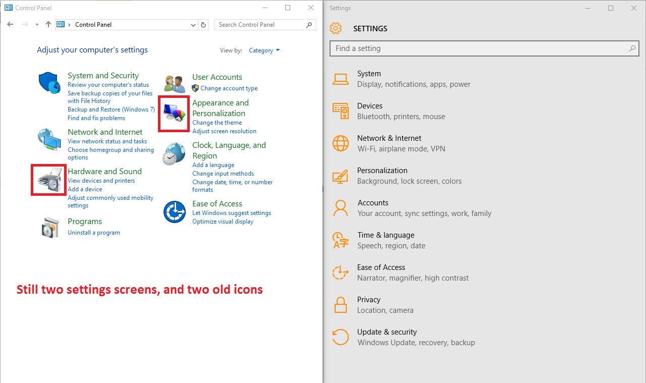
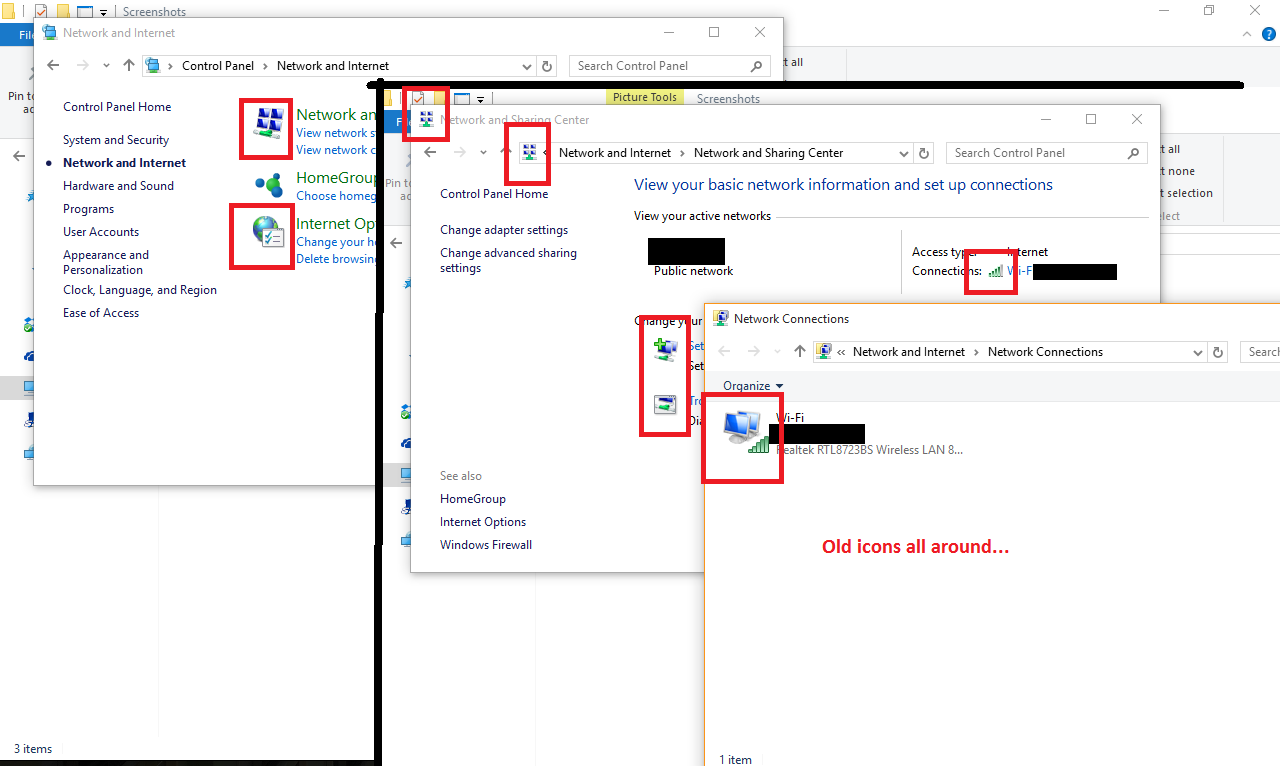
There are still two control panels, with certain things only accessible in one of them, and others available in both but with different names for the same thing (or the same thing, but negated, as is the case with screen rotation lock – in some places, “on” means “do not rotate”; in others it means “allow rotation”).
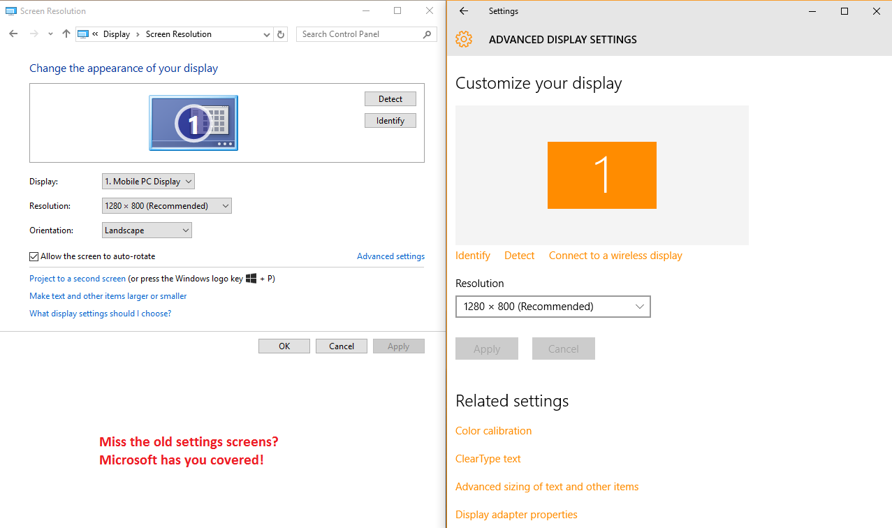
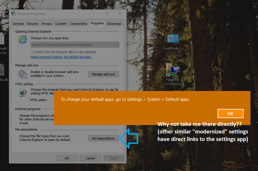
At least, there are now some more links between the two settings panels, but sometimes Windows will just tell you “This setting is now on …” without actually taking you there.
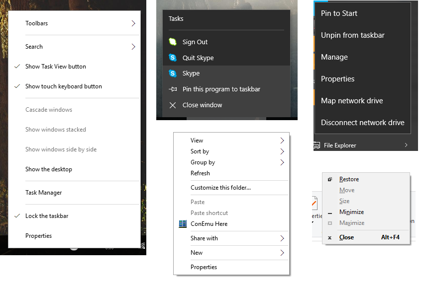
Depending on where you right-click (and, for certain things, how the planets are aligned) you can open at least four different styles of context menu.
Both Windows 8 and 8.1 were, even despite their messy paradigms and inconsistent styles, more polished in terms of looks than Windows 10. Windows 10 has an incomplete icon set, with many icons yet to be updated to the new design. The fact that the icons are very different from those of 7 and 8 (the icon change from 7 to 8 was much more subtle) only makes the problem worse. You really don’t need much effort to find icons yet to be updated.
Leaving design aside, we can see that they tried to remove some functionality, like Windows Update, from the legacy Control Panel. But the migration transmits a feeling of incompleteness:
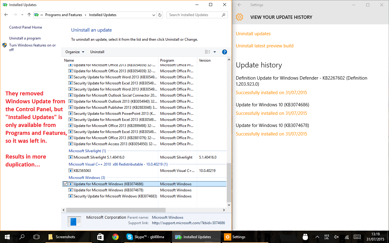
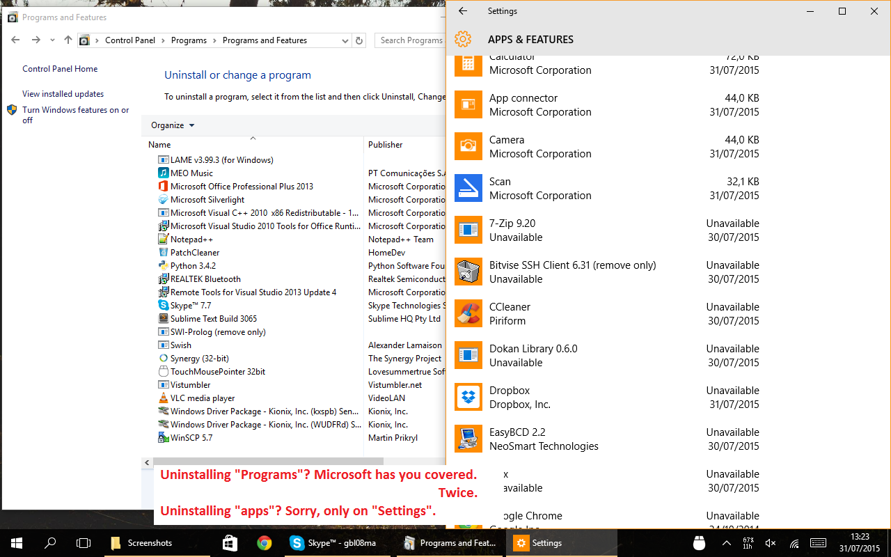
Many settings are duplicated in the Settings app and in the Control Panel. But it’s often not a 1:1 relation: to uninstall modern apps, for example, you must go through the Settings app. Going through the old Programs and Features won’t show these apps.
Certain things were renamed – the “Action Center” is the new notification center of Windows 10 (which is a really appropriate name, and what the Action Center should have been since the beginning). If you are looking for the old thing, it still exists:

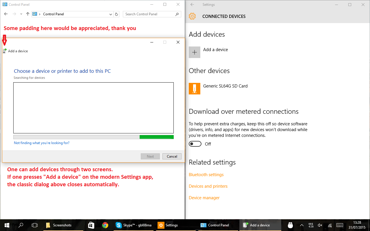
There are at least two ways to add devices, with different UI flows. Also note the lack of padding on the icon of the window to the right:
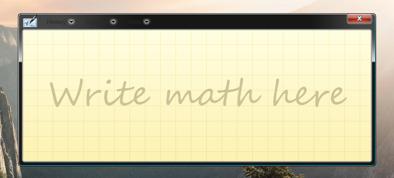
The sometimes useful Math Input Panel is still stuck in the past of Windows Vista or 7, with obvious readability problems in the menu:
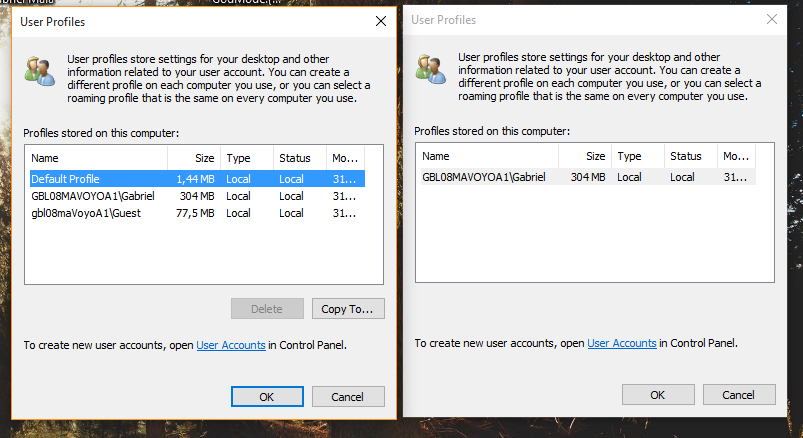
Then there are gems like this dialog, that depending on from where it is opened, shows different items (possibly not exclusive to Windows 10):
The first non-preview release of Windows 10 still contains too many rough edges and suffers from a lack of attention to detail I was only used to seeing in older Windows’ preview releases. I say “first non-preview release”, because as Microsoft is switching to a rolling release model, it no longer makes much sense to call this a “final release”.
Intentionally or not, Microsoft pushed the quality assurance process to the final user. For what is supposedly the best Windows ever made, I’m not impressed. Thank God I didn’t pay for it (even though it’s for sale, and it’s not cheap).